Smartwaiver vs.WaiverSign
STEPHEN PORRITT
WaiverSign vs. Smartwaiver

Stephen Porritt
As human beings, we tend to compare things a lot. We compare cars, we compare hairstyles, and we compare a lot of other things we're not going to mention here. This is especially true when we’re buying things for our business.
Nobody wants to buy a dud of a product, and no one wants to overpay for a service they need, not when those costs come directly out of your profits. So we compare to find the best value.
Well today, we're going to make the comparison a little easier for you, at least for two online waiver solutions on the market: Smartwaiver and WaiverSign.
"Smartwaiver and WaiverSign are similar solutions that offer the same basic functionality—where they differ is in the UI and in supplemental functionality.
Smartwaiver and WaiverSign are similar solutions that offer the same basic functionality—they allow you to make your waivers digital so that they can be signed electronically from anywhere. Where they differ is in the user interface (UI) and in supplemental functionality.
In this article, we're doing a deep dive into the differences between the two. That way, you'll know which of the two better meets your company's needs.
Drafting and Editing Documents
Let's start with the core functionality of both systems: the creation of digital documents. Both Smartwaiver and WaiverSign start by offering to convert your first waiver to a digital document as a free service. WaiverSign does this so you can see your waiver in action (how it’s going to look with your logo, background branding colors, and so forth), and the idea is the same with Smartwaiver.
"Both Smartwaiver and WaiverSign can convert your first waiver for you.
As for creating additional documents for you, Smartwaiver doesn't advertise this as an available service. WaiverSign, on the other hand, can create additional documents for you at a cost of $25 per document (a one-time charge added to your monthly bill). That way, users who don’t have the time or inclination to create their own documents via the editor can have the WaiverSign support team create the documents for them.
"WaiverSign can create additional digital documents for $25 per document.
Speaking of document editors, both WaiverSign and Smartwaiver have them. This is important because some online waiver solutions don't allow you to create or edit your own documents; only their support staff can do it.
Additionally, both platforms allow you to do things like:
- Customize the age of majority
- Add custom fields and questions
- Require accept/decline or initials throughout the document
- Set waivers to expire, and customize the expiration date
- Customize waivers to include your own branding on the document
Both WaiverSign and Smartwaiver allow you to store an unlimited number of waiver "templates" (the industry term for unsigned digital documents). And both offer functionality in multiple languages. For both waiver systems, you can select English, Spanish, or French as the document language. If you'd like it in a different language, they can facilitate that, but you'll have to supply the translations.
A quick note: Smartwaiver mentions Dutch as an option on their website, but the app itself doesn't actually have that functionality. Their support documentation likewise doesn't mention Dutch, so perhaps it's a feature that's still under development.
Beyond that, though, we get into the philosophical differences between the two solutions. Smartwaiver has some additional functionality (which we discuss below), but their user interface is a little cumbersome as a result (more on this later). WaiverSign lacks a few of the customization features that Smartwaiver has, but the document editor is easier to use.
"Smartwaiver has some additional functionality, but WaverSign's document editor is easier to use.
Here are the cool things that Smartwaiver can do, for those who are looking for extra functionality.
Question Flagging
You can set questions and fields to be "flagged" in the system for specific answers, or for having any answer other than a null value. This makes flagged waivers stand out when you're looking through the list and can be used to alert you of food allergies, for example.
Video Embedding
You can embed videos directly into your waiver, allowing you to require people to watch safety videos, training videos, or maybe just a meme compilation you think the whole world needs to see. In order to benefit from this feature, though, you'll have to contact support (an ordeal in its own right; more on that later).
Multiple Signatures
While both Smartwaiver and WaiverSign allow you to sprinkle required accept/decline and initial boxes throughout the document, only Smartwaiver allows you to add more places where a full signature is required. WaiverSign only has the final signature at the end of the document.
Minor Signatures
You can also require a participating minor to sign in addition to the required signature of a parent or guardian.
So that’s the skinny on how document creation works for both platforms. Now let’s talk about what you can do with all the information those documents collect.

Data and Analytics
One of the biggest advantages of online waivers is how it allows you to analyze (and, from there, improve) your business's sales numbers.
"With paper waivers, either you're not collecting data like demographic information, or if you are, it's on paper.
With paper waivers, either you're not collecting data like demographic information, or if you are, it's on paper, so it’s not very easy to crunch the numbers. On the other hand, if the information is already digital, it's a lot easier to get insight into business trends. And if you're collecting the right data, and using the right analytics tools, you can really drill down in the hard numbers.
Smartwaiver and WaiverSign both know this, and so they've built functionality into their systems that facilitate easy collection and analysis of information. Essentially every input field in a given waiver is something that can be tracked in either system and with both WaiverSign and Smartwaiver offering unlimited custom fields and questions, there's virtually no limit to the number of things you can track with your online waivers.
"Every input field in a given waiver is something that can be tracked.
After you've collected all that data, you’ve got to put it somewhere. Both WaiverSign and Smartwaiver advertise "secure storage." Smartwaiver doesn't elaborate on exactly what that means for them, but we’re guessing it's something similar to what we do.
For us, data collected using our system is "secured via SSL, OAuth 2.0, Amazon Web Services Cloud Storage and other top-end security protocols."
"WaiverSign's system is secured via SSL, OAuth 2.0, Amazon Web Services Cloud Storage and other top-end security protocols.
Another thing that both platforms agree on is who should "own" your data. Smartwaiver and WaiverSign both advertise that the data belongs to you. You can export it wholesale whenever you want, and do whatever you want with it. If you stop using the service, both will delete your data from their servers, so only you get to keep it.
Now, collecting and storing information is good, but it doesn't help much if you can't see all that data. That's why both Smartwaiver and WaiverSign have some tools that enable you to find what you’re looking for.
Search Functionality
It all starts with the search function. If you're looking for a specific waiver or a specific participant, this is how you do it. Both WaiverSign and Smartwaiver have a search function. With Smartwaiver, you can search by:
- First name
- Last name
- Date of birth
- Email address
- Tags (more on this in a second)
WaiverSign allows you to search by:
- First name
- Last name
- Email address
- Custom field answers
Each of the platforms has functionality that the other doesn't. With Smartwaiver, it's their "tag" function. Waivers can be "tagged" with a keyword (almost like a hashtag), and then they can be searched by those tags.
WaiverSign, on the other hand, can search by custom field answers. Specifically, you can choose a custom field or question, and then search for specific answers to that question. For example, you might have a custom field that asks for a participant's license number, certification ID, or some other unique identifier. You can then use the WaiverSign search functionality to locate that particular custom field response, and then open the corresponding signed document.
"Smartwaiver allows you to 'tag' waivers. WaiverSign allows you to search by custom field answers.
Once you've found the waiver you’re looking for, both systems allow you to export the signed document as a PDF. Unfortunately, neither WaiverSign nor Smartwaiver has the capability to export PDFs of waiver templates (the unsigned forms), so you'll want to keep copies of the documents you convert to digital on hand.
Crunching the Numbers
Then there's the matter of analytics. Looking up individual waivers is great, but to really benefit from all this data, you need to be able to see trends. So how do we compare to Smartwaiver on that front?
Well, for starters, both digital waiver tools allow you to export your data as a CSV (comma-separated value) file. These files can then be opened in apps like Microsoft Excel or Google Sheets, where you can then do things like:
- Build tables of the data
- Count waivers or participants based on a specified value
- Filter and sort to organize entries by their responses and answers
- Create graphs and charts from the data
- Print reports of relevant data trends
It's all really valuable stuff, but it can take some doing and some expertise (that you may or may not have) to turn the raw data into something you can actually make business decisions with. So what you can do instead is upload that same CSV to a business intelligence tool.
These software platforms allow you to input your data, and then the tool takes care of the rest, turning it into something you can see at a glance. Graphs, charts, images, and more are created for you, and all the number crunching is done by the machine, taking the burden off of you.
"Ok," you say, "So you can do things with the data. But can’t the waiver app itself tell me anything?"
Yes, actually. This is where the analytics dashboard comes in. Both Smartwaiver and WaiverSign have them, and they can offer a little bit of perspective on your data. We say "little bit," because it doesn't show everything you might want to see. For example, in WaiverSign, you can see visual representations of the following tracked data points:
- Participant age
- Participant gender
- Documents signed
- Date of signature
- Number of signatures per day
- Number of document templates
- Number of events
- Number of trees saved
Smartwaiver’s dashboard adds a few additional values. It tracks:
- Participant age
- Participant Gender
- Country of origin
- State of origin
- Zipcode of origin
- Day that participant signed waivers
- Day that participant checked in (more on this below)
- Daily counts of waivers signed
- Hour of the day that waiver was signed
- Check-in count
- Adults participating
- Minors participating
- Kiosk signings
- Web-based signings
Smartwaiver's dashboard highlights a functionality that WaiverSign doesn't have. Participants who have signed waivers can be "checked in," marking that they actually arrived for the activity or event. This value can then be tracked by both the dashboard, and by the data that's exported to CSV file. You can even track the number of check-ins and check-in days.

The RESMARK Factor
Now you might be thinking by now that WaiverSign's a bit of a slouch in the analytics department, but that's not entirely true. In fact, nearly all of the things that Smartwaiver can do can be duplicated in the WaiverSign system, you just need the full RESMARK suite to make the most of it. Even the check-in function is something that RESMARK enables you to do.
Here's what we mean. Smartwaiver has a lot of these functionalities built-in because all they do is online waivers. They have to include the functionality in case you're only using their solution.
WaiverSign, on the other hand, is part of a larger toolset called RESMARK. It's an online reservation and marketing solution designed for booking tours, activities, and events. It includes marketing automation capabilities, and enables the management of distribution channels (like travel agents, concierges, and other resellers).
A large number of our WaiverSign users either are benefiting or could benefit from the whole suite of tools. Signing up for RESMARK opens up a lot of functionality, even within WaiverSign itself. Most relevant to our current data discussion is the enhanced analytics dashboard, and the ability to integrate with Google Analytics (which allows you to track online conversion rates, among other things).
"A lot of business that need a waiver solution could also benefit from the full suite of RESMARK booking and marketing functionality.
And speaking of integrations...
Device and Software Integrations
Integrations are another area where the philosophies behind each solution become apparent. Both WaiverSign and Smartwaiver offer a blend of internal solutions and 3rd-party integrations to solve common problems for online waiver users. But there's a bit of disagreement about which functionalities should be facilitated by internal solutions.
Smartwaiver is a dedicated waiver app, meaning they've focused all their efforts on filling out functionality to serve digital waiver customers (and only digital waiver customers). As mentioned above, WaiverSign is but a single tool within the larger RESMARK toolset, so its focus is broader rather than deeper.
"Smartwaiver serves just digital waiver customers, while WaiverSign can help you with booking, marketing automation, and distribution management.
Here’s the breakdown of four important functions.
Kiosk Apps
Having a kiosk at your location for guests to sign their waivers when they arrive can be a huge help when it comes to shortening check-in times. Walk-ins will need a way to sign their waivers, and even among those who pay ahead of time, there will always be a few waivers that slip through the cracks.
That's why both Smartwaiver and WaiverSign enable businesses to use kiosks for signing waivers. Smartwaiver, for example, has two dedicated kiosk apps (one for Android, one for iOS), allowing you to use mobile devices as kiosks.
"Smartwaiver has dedicated kiosk apps, but WaiverSign works with nearly every popular (and free) kiosk app.
WaiverSign, on the other hand, works with a host of popular 3rd-party kiosk apps, such as Kiosk Browser Lockdown and Kiosk Pro. By downloading and setting up one of these apps, you can provide kiosk functionality to your guests who still need to sign waivers when they arrive.
QR Codes
When it comes to producing and using QR codes, Smartwaiver is the one with the internal functionality, while WaiverSign again interfaces with 3rd-party apps. But it's important to note that they use QR codes to do different things.
WaiverSign provides QR codes for participants to scan as a way to direct them to the waiver they need to sign. Conversely, Smartwaiver enables their clients to scan QR codes on signed waivers as a way to check-in guests.
Here again, it's important to mention that the "check in" function that Smartwaiver has is something that WaiverSign can actually do. But because it's part of the RESMARK reservation system, it's a functionality of the whole toolset, rather than part of the WaiverSign standalone product.
Online Booking System
Now it's time for the two systems to switch sides. We've already mentioned that WaiverSign is part of a larger toolset. The primary function of the larger toolset—called RESMARK—is to provide online tour, activity, and event booking functionality. WaiverSign is built into RESMARK, so the two are fully integrated and share live information with each other.
This is probably WaiverSign's biggest strength—the fact that it’s part of a whole toolset. With RESMARK, you can embed online booking functionality directly on your website. You can send customers directly to the waivers they need to sign (as well as have them forward the links to additional party members who need to sign). And you can see who's signed in real-time.
"This is probably WaiverSign's biggest strength—the fact that it can do more than just waivers.
Smartwaiver, on the other hand, interfaces with a number of booking and reservation solutions. It doesn't interface with RESMARK though, only our competitors. That said, the integrations are pretty thorough; with some of them, you can even route customers through your booking process directly to your waivers.
Email Marketing
Finally, we have email marketing and marketing automation. Smartwaiver again outsources these tasks to 3rd-party solutions like Mailchimp, and unlike their integrations with online booking systems, the information isn't as close to real-time.
WaiverSign itself isn't built with marketing automation capabilities, but the larger RESMARK suite includes CruiseControl, a full-featured email marketing tool. With it, you can set up lead capture forms on your website, and then set up automated email campaigns that nurture those leads and encourage them to convert into customers.
"With WaiverSign's sister apps, you can set up lead capture forms on your website, then nurture those leads with automated emails.
Even once they've made a purchase, you can continue to send automated emails to remind guests what to bring, to remind them of their activity or event, and more. Lastly, once the activity is over, you can set up emails to go out to encourage guests to leave reviews on relevant social media sites, and to invite them to return to your business.
Final Thoughts on Integrations
Beyond these features, both Smartwaiver and WaiverSign are capable of online waiver links and email links. And both are capable of integrating directly with your website. Smartwaiver can embed the waivers directly into your site, and RESMARK can link up so that customers can book an activity without ever leaving your site.
Smartwaiver can also function offline, syncing all new information to your data in the cloud once you’re connected again. They also have a feature they call "WaiverSync" that allows you to set your cloud storage to automatically download signed waivers to a local device of your choosing.
"Smartwaiver has specialized, doubling down on their online waiver product. WaiverSign (which is part of RESMARK) is instead a one-stop-shop built to serve tour, activity, and event suppliers.
Ultimately, the two solutions approach integrations from opposing viewpoints. Smartwaiver has specialized, doubling down on their online waiver product. The downside here is that if you need other functionality (like marketing automation or online reservations), you have to pay for each of those separately.
RESMARK (and by extension WaiverSign) has been built to be a one-stop-shop, offering multiple core functionalities under one roof. The reason we did this is simple: most of our clients need the whole suite of tools, and paying for them all separately can be rather costly.
"RESMARK includes multiple business tools for a single price, and one that's much cheaper than paying for all of those tools separately.
We built tools that do the jobs of three or more separate solutions and gave them a price tag that's easy to swallow for everyone—from small tour operators to large adventure travel businesses operating at scale.
User Interface
Ok, that's how these systems play with others, but what's it like to use the waiver apps themselves?
Up until this point, there's been quite a bit of similarity between the two systems. The UI, however, is where we start seeing a real difference between Smartwaiver and WaiverSign. Yet again, this stems from a difference in the ideologies behind the software.

A Closer Look at Smartwaiver
Smartwaiver, for instance, has chosen to maximize the available functionality, packing in every feature they can to offer the broadest spectrum of what their users could possibly need. It's a strategy that's made them one of the most popular options for online waivers.
The downside to this strategy seems to be the slightly clunky UI for their document editor that they built to facilitate all the choices they've wanted to offer.
"Smartwaiver maximizes available functionality at the cost of some ease-of-use.
The Downside
Creating or editing a document is a process with multiple steps. The editor is broken up into several different sections, each on its own tab. Getting to the final "publish" button (which you have to hit before you can see the document all put together) requires stepping through six other tabs first, making your selections regarding what you want in the waiver and how you want it to look.
Whenever you open a template up again to edit it, you're presented with the same six tabs (seven, if you count the publish tab), and you may have to dig a little to find the options you’re looking for.
The Upside
Smartwaiver has a lot of default features that open up a lot of possibilities for customization. In the spirit of transparency and honesty, we've put them all together in a list. Smartwaiver:
- Has an option allowing you to set an age at which a minor’s waiver expires
- Has an option to require a participating minor to sign (in addition to their guardian)
- Has a default field for participants and signers to opt-in (or out) of email communication
- Has a "share on Facebook" and “share on Twitter” options to send the link to other people who need to sign
- Has the option to send an email after signing that allows the signer to download a copy of the waiver
- Has the option to create a custom (vanity) URL for the waiver
- Has the option to redirect participants to a different URL after they are done signing a waiver (in case you have a landing page you want them to see, for example)
- Has the option to make the waiver a non-indexed page for search engines
- Has the option to have fields required for both the minor and the guardian, or just for the adult signing the waiver
- Has the ability to group custom questions into sections, each with a section title
Smartwaiver can also have a variety of custom fields (or questions). They can be:
- Text boxes
- Yes/no
- Pull down
- Checkboxes
- Multiple choice
- Date
- And rich text (in case you want text with formatting)
We also want to note here that Smartwaiver has fewer standard fields than WaiverSign (as you'll see in a moment). The only ones they include are:
- Email address required
- Mailing address
- Emergency contact & phone
- Insurance provider & Policy number
- Drivers License/ ID card number
- Option to display or not display these fields on kiosk version
Beyond that, the functionality of the document editor achieves the same ends as WaiverSign's.

A Closer Look at WaiverSign
Here at WaiverSign, we’ve taken the opposite approach, prioritizing simplicity and ease-of-use. Our interface is a lot more straightforward than Smartwaiver's, but the user-friendliness comes at the cost of a few customization options.
"WaiverSign prioritizes simplicity and user-friendliness at the cost of a few customization options.
The Downside
When you compare the two on paper, WaiverSign has the shorter list of options. It lacks some of the more specialized features that Smartwaiver has, which may be a deal-breaker for some businesses.
For example, our custom fields can take the form of:
- Text
- Text boxes
- Lists
- Checkboxes
- Body copy that has an accept/decline or initial requirement
It's a shorter list than Smartwaiver's, despite having all the same core functionality.
The Upside
WaiverSign's interface is designed to make setting up documents quick and easy. The entire document editor is displayed on a single page, with all the options together in one place. No tabs, no extra steps.
And options are grouped in ways that are easy to find. The top section is where you'll find options for the body of the copy, the standard information fields are in the middle, and custom fields are at the bottom.
Additionally, WaiverSign has more default fields than Smartwaiver. They include:
- Title
- First name
- Nickname
- Middle Name
- Last name
- Gender
- Organization
- Phone
- Date of birth
- Street address
- Country
- Postal code
- City
- State
- Identification #
WaiverSign also has a pre-waiver questionnaire that collects guest information. This information is then populated on all the waivers they need to sign, so they don't have to fill in redundant info more than once. Finally, WaiverSign also has a checkbox for signers to opt-in to email communications.
So for those looking for a more "plug-and-play" style system, WaiverSign is the safer bet.
Additional Features
We've talked about nearly all of the features, functions, and interfaces, but there were a few that were a little harder to categorize. So we're discussing them here.
Both Smartwaiver and WaiverSign:
- Enable participants to sign multiple documents at once, taking information from a previous form and filling it in on a successive one
- Allow participants to sign waivers from anywhere, as long as they have an internet connection
- Can group waivers by "event," and event group coordinators can be set
- Offer an unlimited number of users
On top of that, both WaiverSign and Smartwaiver offer custom language setup to meet the needs of participants that speak a language the platform doesn't currently have functionality for—though you will have to provide all the translations in both cases since it's obviously difficult to translate into a language you don't know.
Lastly, both allow you to make notes on a signer's file to add relevant information.
Smartwaiver-Only Features
This is another place where we have to give credit where credit's due. Smartwaiver has a handful of additional features that WaiverSign does not, and for some of you they may be the deciding factor.
"Smartwaiver has a handful of additional waiver features that WaiverSign does not, but those features aren't necessarily must-haves.
For one, Smartwaiver can take photos of the document signer, provided they sign via the kiosk app. The app uses the mobile device's camera and snaps a quick picture as they sign, adding the photo to their file. And speaking of signing on kiosks, Smartwaiver allows for finger signing on mobile devices.
A Quick Note on Signatures
"As cool as finger signing is, it's not strictly necessary, legally speaking.
Because of how current digital signature laws are structured, once you click that little box that says you agree to sign the document digitally, pretty much anything will work as your signature. Even if it's nowhere near your normal signature, it counts. It's why we haven't made finger signing a feature sooner.
The Waiver Index
Finally, there’s a feature that we don’t have because we decided to handle the issue differently. See, Smartwaiver has this thing they call a "waiver index." This index is a selection screen that displays buttons for each of your waiver templates. So if you offer, say, massage, acupuncture, and underwater basket weaving classes, you send guests a link to the index, and when they click on it, they simply choose the waiver that applies to the service they’ve paid for.
WaiverSign effectively does the opposite. Rather than having a selection screen and allowing the signer to choose the waiver, WaiverSign allows you to send a single link that contains all of the waivers that are required based on what the signer paid for. That way, they are presented with only the waivers they need to sign, and there’s no selection needed.
Smartwaiver's method is more convenient for the client (i.e. you), but it leaves room for error on the part of the document signer. If they're not careful, they may sign the wrong document and think they're done.
"Smartwaiver's method is more convenient for the client (i.e. you), but it leaves room for error on the part of the document signer.
WaiverSign's approach is a smoother user experience for your customer, but may take a little extra effort on your part to make sure the right waiver link is sent. That said, it also takes them through each waiver one by one, and uses the information from previous waivers to fill in each successive one (that way, they're not just filling out their name and address multiple times).
"WaiverSign's approach is a smoother user experience for your customer, but may take a little extra effort on your part.
Ok, we've covered just about every feature there is to cover (and the current word count reflects that). Now let’s talk about the last two important details: price, and customer service.

Price
Like a lot of what we've already discussed, price highlights fundamental differences in approach between Smartwaiver and WaiverSign.
"Price highlights fundamental differences in approach between Smartwaiver and WaiverSign.
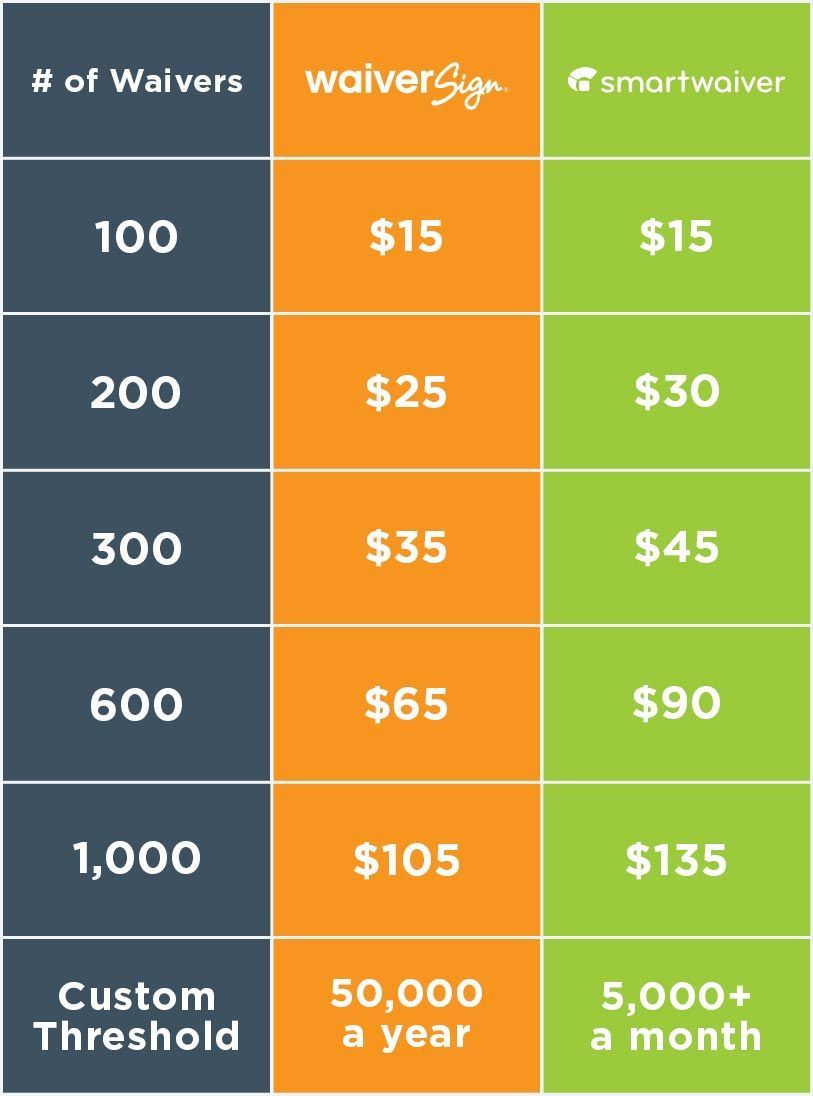
Smartwaiver has seven pricing tiers, with each tier corresponding to a maximum number of waiver signings. There are no contracts, and you can cancel or change your plan anytime. The main drawback here is that you'll have to change your plan if you want to sign more waivers. Once you hit the max for your plan, it won't allow you to take any more signings (which might be problematic in the middle of a busy workday full of guests and participants).
WaiverSign instead has a single base price that includes 50 document signings. After those first 50, each additional signing costs just 10¢. There’s no limit to the number of signings, no tiers to switch to, no wasted signings if you paid for some you didn't use. You’re simply billed at the end of the month for the base price plus additional signings, and that’s it.
Here's what those two pricing strategies look like, across different amounts of document signings in a single month.
Custom Threshold
The "custom threshold" is the point at which your company can qualify for custom pricing. What does that mean? Well for both brands, as the number of documents you have signed goes up, the cost per signing goes down. In other words, if you're processing enough documents, you’ll get a discount for "buying in bulk."
The custom thresholds as listed on the respective websites are kind of "apples to oranges," if you know what we mean. So let's convert and compare.
Smartwaiver's threshold is 5,000 a month. Assuming that as a minimum, and multiplying that by 12 months, you get 60,000 signings in a year. WaiverSign's, on the other hand, is 50,000 a year. Dividing that evenly over 12 months (assuming year-round business operation), that's only 4,167 signings a month.
Now, there's not really any of us that can say they have the exact same number of sales each month of the year. But if you're doing business all year long, and you’ve got substantial customer traffic each month, WaiverSign will qualify you for custom pricing at a lower threshold than Smartwaiver, saving money on each month’s bill.
Similarly, if you only operate part of the year, but have some pretty impressive numbers during those months, you'll qualify for custom pricing through the whole year. As long as you hit that threshold, you benefit from the discounted pricing, even during the slow months (rather than having to maintain high numbers of participants throughout each month of the year).
That means you'll have hit the custom price threshold by the time you reach the limit of the equivalent plan at Smartwaiver.
What's more, because WaiverSign's cost structure only requires you to pay for the waivers you use, you're not paying for waivers you're not using. And finally, if you have periods of the year where you don't do any business, both Smartwaiver and WaiverSign have a "storage only" plan you can switch to, which only costs $5 a month.
To sum up, for those looking for a fixed cost each month, Smartwaiver has the more attractive pricing strategy. If, on the other hand, you'd like to pay less overall, and don't want to worry about limits, WaiverSign's cost structure is the better bet.
Customer Service
Finally, let's talk about how well each company takes care of their clients. We'll start with online ratings.
Capterra, a software review site (essentially Yelp, but for business software) is the most common benchmark used to measure platforms such as Smartwaiver and Waiversign. Looking at the profiles for either of them reveals favorable customer feedback. Smartwaiver has a slight lead, with a rating of 4.9 out of 5. WaiverSign's right behind them, though, with a rating of 4.8 out of 5.
Maybe that didn't really clear anything up for you, so let's try another angle. How about the kiosk apps? Let's take a look at those.
Smartwaiver's ratings for their kiosk app are less impressive, at 2.8 stars on Google Play, and 3 stars on the App Store. That might look bad, but compare that to some of the most popular kiosk apps that WaiverSign is paired with. Kiosk Browser Lockdown, for instance, sits at a 2.9 on Google Play, and Kiosk Pro Lite is only a little better at a 3.5 on the App Store.
So it seems most kiosk apps are feeling the sting of customer feedback. It is important to note, however, that on the pages for Smartwaiver’s kiosk app, the most common complaint is that the app isn’t compatible with the device the client bought to run it on. Similar problems come up in the reviews for their other app.
Ok, well, if the apps are all a toss-up, how about support documentation? Where do I go when I have a question or need to know how to use the system?
Both Smartwaiver and WaiverSign have thorough documentation to provide answers and solutions to common problems. Smartwaiver does have a larger library than WaiverSign, but our library is constantly growing, so we may catch up before you know it.
"But what if I have a real problem?" we hear you say. "How easy is it to get ahold of someone to help me resolve the issue?"
That’s a very good question, and if there's any clear winner in this category, it's probably decided with this. With WaiverSign, support can be reached by email, by phone, and even by in-app chat to answer your questions. We're quick to respond during normal business hours (for Mountain Standard Time, that is), but even if you catch us after hours or on weekends, we respond promptly to clients with urgent needs.
"With WaiverSign, support can be reached by email, by phone, and even by in-app chat.
Smartwaiver is a little less accessible. If you have an issue, the only way to contact them is to use their email form on their website. They don't list the phone number for support, and they don't list their hours of availability. It may be that their support documentation is more robust simply because they want you to figure out problems on your own—a sort of "self-service" customer support.
Conclusion
Congratulations! You made it to the end of the article. It's kind of impressive, actually. Hopefully you learned a few things, and hopefully we’ve helped make your decision about which solution to use a little easier.
In case you've just suffered from reading overload, or you just skipped to the bottom to spoil the ending, here's a final verdict on the two systems.
Smartwaiver is a competent, effective online waiver system with high levels of customization and lots of features. It's ideal for businesses that need an expanded feature set, that don’t mind paying extra to get other solutions they need from 3rd parties, that don't require a lot of customer support, or that only need a waiver solution.
For those who want a solution that's less expensive and easier to use, who want easier access to support, or who want a solution that’s fully integrated into other tools they need, WaiverSign is the obvious choice.
"Try WaiverSign for free
If our brutal honesty and frank discussion about our own strengths and weaknesses has intrigued you, we invite you to schedule a time to talk with us. We'd love a chance to speak with you personally to see if WaiverSign would be a good fit for your business.
See If WaiverSign Works For You
Don't wait to make the next step in streamlining your business.


